June 1983
Looking back at these old slides, I am struck by the palpable presence of objects in a few of the images. I remember having that feeling when first getting the slides back from the processors, and raising them to the light. It is something to do with the qualities of Kodachrome, especially when under-exposed a little, of deep contrast and deep shadow, of the acute precision that it gave to textures and lines. This impression has an affinity with being physically present at the scene that goes beyond the visual similarity of the two: an array of novel and contingent objects under a certain light at a certain moment, engraving itself on a young mind and eye. The freezing of a process in which labour, growth and entropy come into slow collision.
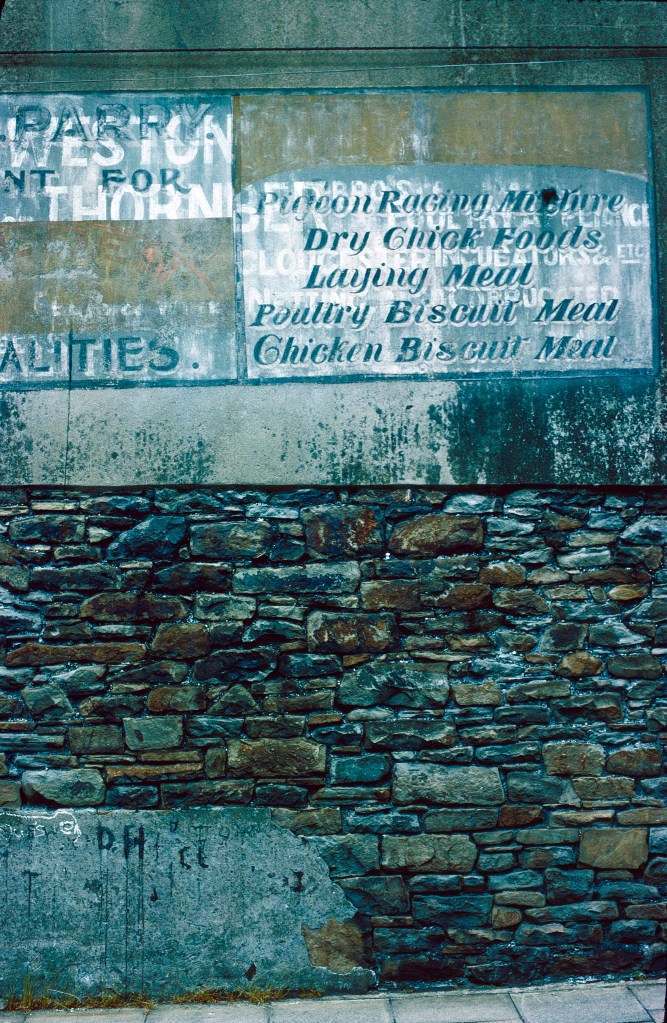
For me, this photograph is one of those images. Taken in the mining village of Cwmaman, it is a record of the old conflict of commercial display and graffiti, which is sometimes openly hostile, and always replete with paradox. Graffiti competes for attention with advertising and occasionally vandalises it; commercial forces continually efface graffiti, as evidenced in the Rothko-like oblongs of new paint on old that adorn so many urban walls; and both are—for different reasons—destructive to the psyche.[1]
In careful calligraphic style, hand-painted advertising for, among other goods, ‘Pigeon Racing Mixture’ and chicken feed stands above a few crude graffiti. The graffiti are made not with spraycans but with brushes, as can be seen from the runs. The adverts have become a palimpsest as, with aging and weathering, the older layer reappears as its replacement fades.
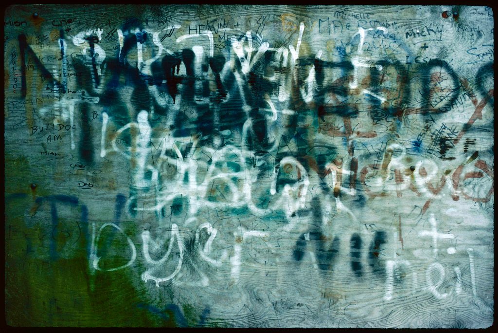
The palimpsest is common with graffiti, too, and here is partly created by weathering and the prominent texture of the wood grain, but also—as in advertising—by the competitive over-writing of one name with another. In this mix of spraycan and marker-pen writing, some names are simply submerged by new layers of writing, as one poster advert is covered by the next, while some names have been deliberately crossed out.
In 1983 in the valleys, this writing was almost always only of names, and if it had an aesthetic, it was a negative one: a revolt against the neat and controlled handwriting demanded at school. The leaving of one’s name is an ancient practice, of course, and what is new here is the technology of mark-making, no longer laboriously carved but the expressive flourish of an instant. Amid the resulting visual noise, in which signals are often lost in over-writing, erosion and the contingencies of surface, there is a register both of alienation and of competition, an internalisation of the general struggle for money and recognition that awaited the children who had made it.
Names, then: budding assertions of identity and individualism, made without artistic pretensions yet with a subterranean aesthetic of refusal and rejection, in a destructive decoration of a degraded environment. Working in the children’s home and the special school, some of these names were familiar to me, and were connected to tales of poverty, malnutrition, neglect, substance abuse and petty crime.
What other graffiti would these writers of names have seen? For those who had ventured out of the valleys, say, to Cardiff, more of the same. Perhaps some glimpses of a more elaborate style in US films set in dangerous cities. The book that was over time to deeply change graffiti across the globe, Martha Cooper and Henry Chalfant’s Subway Art, would only appear the following year. There was no available internet, of course, and indeed many households, for reasons of economy, had no phones. This is an ur-graffiti of scrawled names that lack the distinctive and thought-out style of a tag, or its elaboration in sophisticated, large-scale and technically demanding pieces—let alone the overtly commercial nature of much of the street art that would eventually follow.
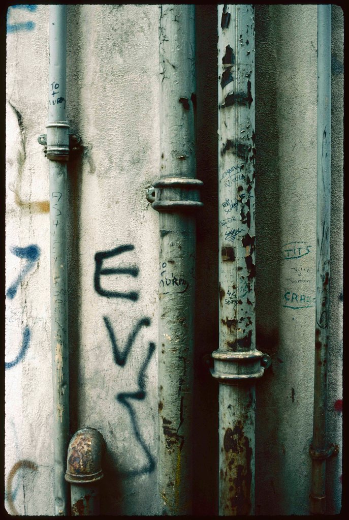
The names in this image have a tiny, tentative addition: the word ‘tits’, wrapped in its own crudely drawn oval. It brings to mind a girl in the school who endured the persistent cat-calls of some boys: ‘BT—Phone Home’, a puerile but multilayered pun on the Spielberg film and the (soon to be privatised) phone company. While I understood that she was being taunted, it took me a while to realise what ‘BT’ stood for. As this phrase was repeated over and over, her face would set into a mix of exasperation, contempt and resignation.
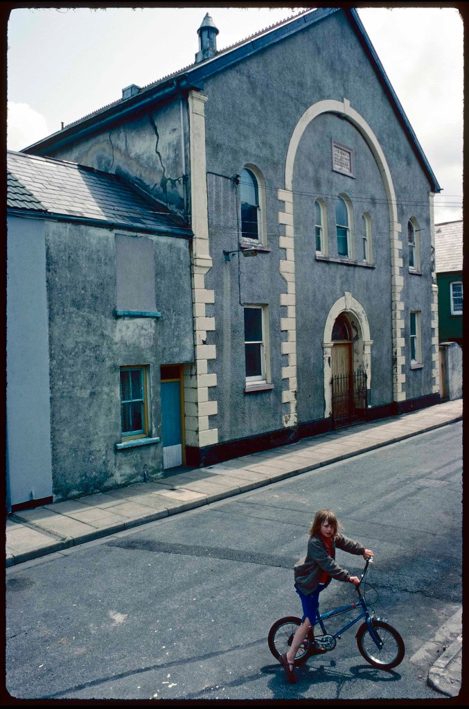
Back in Cwmaman, I was taking pictures around the Seion Baptist chapel when this girl stopped to look—photography of such an environment then being a curiosity. I find the expression on her face hard to read: she looks at me steadily, perhaps a little suspiciously, but without fear or hostility. It is a cliché of photography, but I cannot help wondering about her life in that place, if she stayed, in the forty years since, and in the capitalist competition in which so much is determined by location, money and upbringing. (Little has changed since.) And by gender, of course, in which the boyish taunts were part of a formidable armoury by which males asserted their right and their power to put girls in their familiar, subsidiary place.
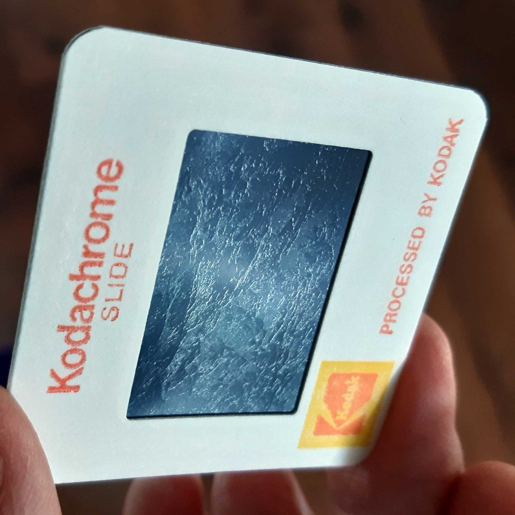
The flow of time, labour, play and entropy stopped for an instant, in a palpable rendering of the texture of the old chapel walls, the much-patched road, the blocked-up window, the scabs on the girl’s shin. Strangely, if you turn over a Kodachrome slide and let the light glance off its surface, a relief pattern appears, corresponding to forms in the image: a physical impress of the light recorded, and—it is tempting to say—an allegory of the stamping of the scene on the mind.
[1] In the 1990s, I explored those tensions in a chapter of Gargantua: see the section on the book here.

Leave a comment